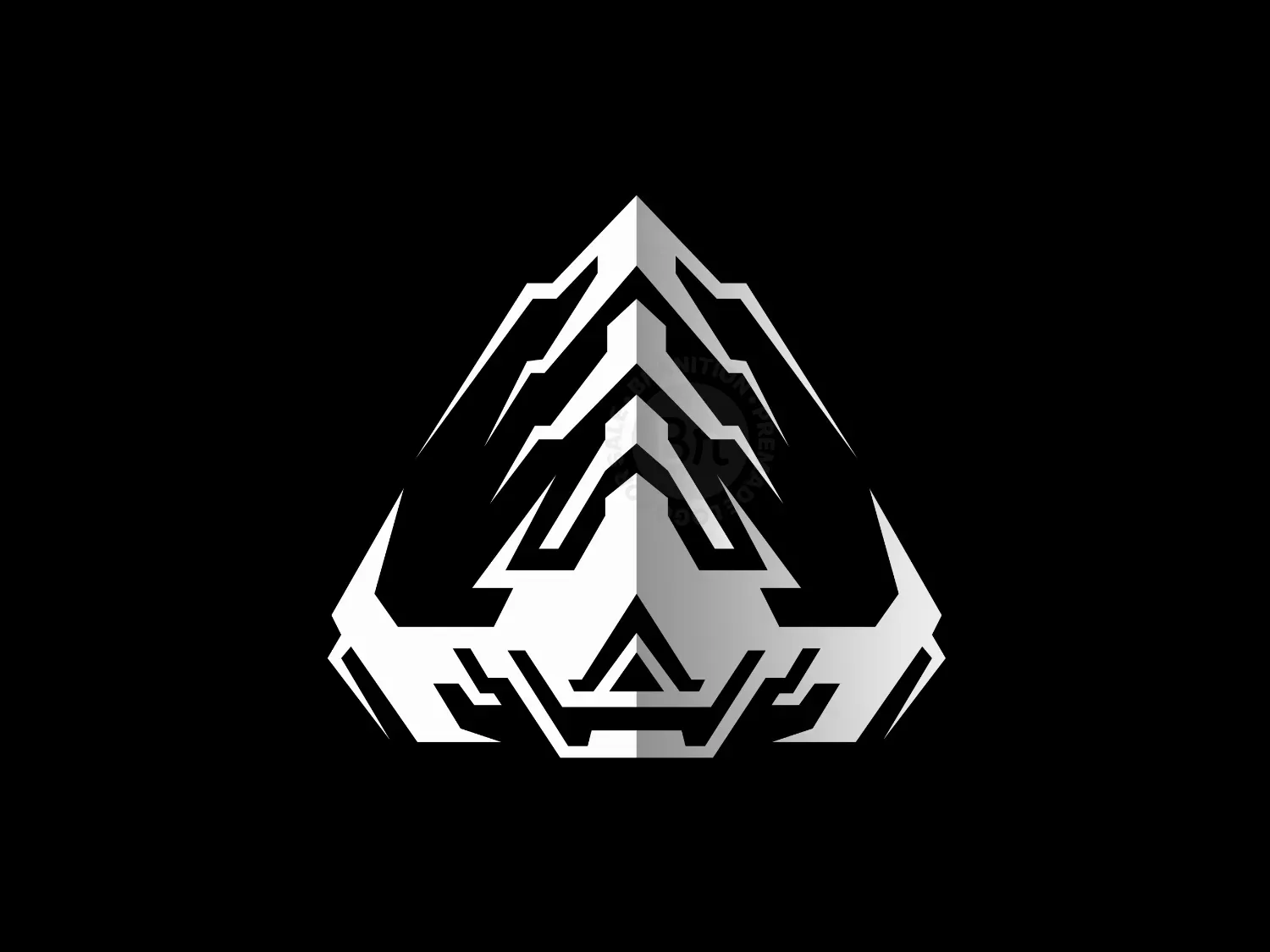
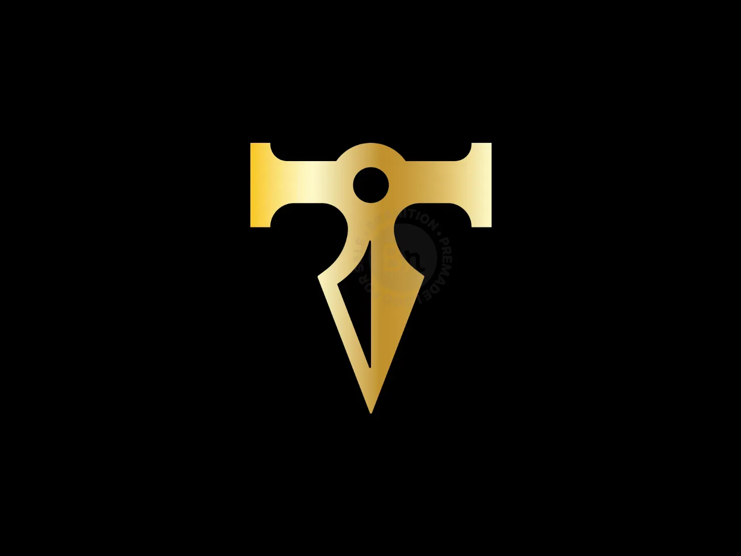
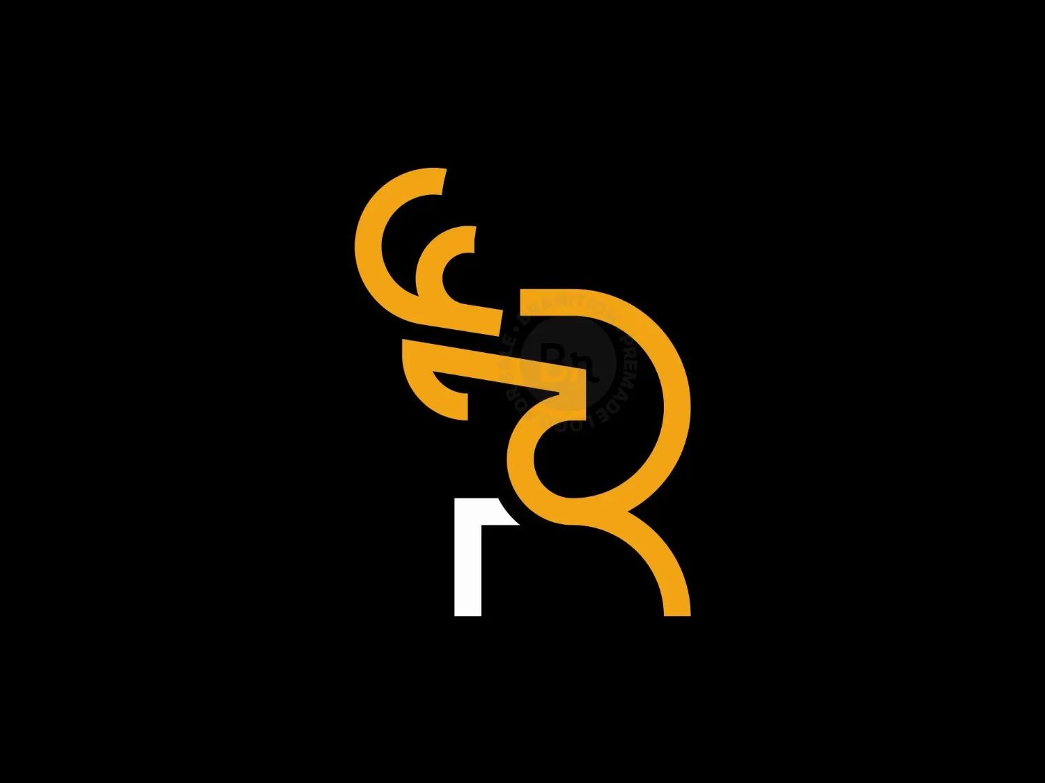
LETTER T
 KS Graphics
LETTER T
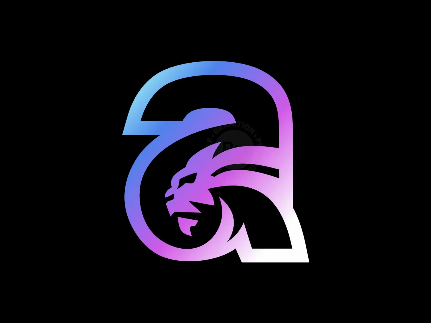
The foundation of the design is a bold, angular capital "T".
It is formed using sharp geometric lines and mirrored symmetry, giving it a sense of balance and precision.
The use of gradient shading (from silver to black) creates a metallic, beveled appearance, adding depth and a premium, high-tech feel. The symmetry and sharp angles suggest structure, reliability, and innovation—qualities desirable in industries like technology, esports, or defense. The extended arms and stylized edges resemble wings or blades, subtly evoking speed, agility, and power.
This high-contrast palette conveys professionalism, sophistication, and modernity. It also hints at high-performance and futuristic concepts.
Potential Applications: Tech startups, gaming/esports organizations, automotive, cybersecurity firms, or any brand focused on strength and innovation.
As a primary logo, icon for applications, apparel branding, or digital watermark due to its scalability and distinctiveness.
Additionally, there are some brand designers who are interested in designing logos to specifically sell them in logo design marketplaces like here.
If you want to purchase a logo from a designer and don't want it to be present even on inspirational design sites after purchase, make sure to request this from them once you've purchased it.