


What is a lettermark logo?
A lettermark logo is a type of logo design that uses a single letter to represent a brand or company. This type of logo is often used when the company name is too long or difficult to remember, or when the company wants to create a more minimalist and modern look. Lettermark logos are often used by well-established brands, such as IBM, CNN, and HBO.
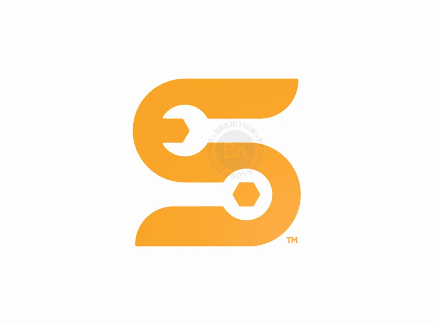
Why choose an "S" lettermark logo?
The letter "S" is a popular choice for lettermark logos because it is a versatile letter that can be stylized in many different ways. It can be curved, straight, or angled, and can be made to look modern, classic, or even futuristic.
Additionally, the letter S is often associated with words like "success," "strength," and "speed," making it an ideal symbol for a brand. By choosing an "S" lettermark logo, a brand can create a memorable and impactful visual identity that stands out from the competition.
Understanding Your Brand Identity and Target Audience
Before you start hiring a logo designer to design an S logo for your brand, it's crucial that you have a clear understanding of your brand identity and target audience. Your logo should accurately represent your brand's values, personality, and brand message.
Consider the emotions and associations you want your logo to evoke in your target audience. Understanding your target audience's demographics, preferences, and interests can also help you in understanding the logo design that would resonate with them.
To start, you can first explore different logo styles, trends, and techniques that are relevant to your industry and then conduct market research, analyze your competitors, and if you can, gather feedback from your target audience to gain valuable insights about the ideal logo design for your brand.
Once you have a clear understanding of your brand's personality, values, and overall look and feel, you can more conveniently convey to the designer you're hiring to design a logo that would capture these qualities.
Choosing the Right Colors and Fonts
For a well-designed S logo, it's crucial to choose the right colors and fonts that align with your brand's identity and appeal to your target audience.
Colors evoke emotions and can convey different messages, so it's important to select colors that reflect the desired mood and personality of your brand. For example, colors like blue and green can create a sense of calm and trust, while bold and vibrant colors like red and orange can convey energy and excitement.
Similarly, fonts play a significant role in logo design as they can communicate different styles and characteristics. For example, sans-serif fonts are often associated with modernity and simplicity, while serif fonts can convey a sense of tradition and elegance.
By carefully deciding the colors and fonts, you can have a S logo that is visually appealing and effectively represents your brand.
Tips for an Effective S Lettermark Logo
When choosing the style of your brand logo, it's also important to keep it simple and memorable. A cluttered or overly complex logo can be confusing and difficult to remember.
Instead, opt for clean lines and minimalistic designs that are easy on the eyes. Remember, simplicity is key when it comes to creating a memorable logo. Focus on having a design that is unique, recognizable, and stands out from the competition.
Finally, make sure to test the designed logo in different contexts and on different backgrounds and mediums to ensure it remains effective and legible and also is scalable and versatile enough to be used in a variety of contexts without losing its impact.
The Role of a Professional Designer in Creating a Successful Logo
While it is possible to create a logo on your own, hiring a professional designer can greatly increase the chances of creating a successful logo.
A professional designer has the skills and expertise to create a logo that not only looks great but also effectively represents your brand and resonates with your target audience.
They can also provide valuable insights and guidance on color choices, typography, and design elements to ensure your logo stands out and makes a lasting impression.
Test and Refine Your Logo Until It's Perfect
Once you have received the logo concepts from your logo designer, it's important to test it out and get feedback from others. Show it to friends, family, and even your audience if possible to see how they respond to it.
You may also want to try out different variations of your logo to see which one resonates best with your audience. Don't be afraid to ask for changes and refinement of your logo until it's perfect and truly represents your brand's identity.
Remember, your logo is a crucial part of your branding strategy and can help you stand out in a crowded industry.
Maintaining Consistency in Branding Across All Platforms
One of the most important aspects of a business logo in branding is consistency. Your logo should be used consistently across all platforms, including your website, social media profiles, business cards, and marketing materials.
This helps to establish brand recognition and makes it easier for your audience to identify your brand.
Make sure to also use the same color palettes, fonts, and design elements in all of your branding materials to create a cohesive and recognizable brand identity.